Google Translate: Testing new feature
USABILITY TESTING
2022

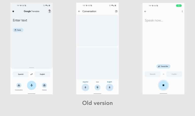
How might we understand how usable Google Translate's new simultaneous translation 'open mic' feature is and if it should replace the old manual version?
Solution
We conducted usability testing sessions in our in-house lab. Since we were testing a conversation feature, sessions were run with 6 pairs of participants that didn't speak each other's languages. We found that the new feature was helpful, but not user friendly due to high translation error and lack of speech-pause detection.
Role
Associate UX Researcher in a team of 2 UXRs, along with the Lead Researcher. We equally split all research tasks between us. Periodic check-ins were also held with Google Translate's in-house UXR team.
UX Research Process
1. Creating a discussion guide
2. Recruiting participants
3. Running test sessions
4. Analysis and findings
5. Product
decision
Creating a discussion guide
Understanding the needs of the project, we created a discussion guide for our usability tests.
Our aim was to test how the new open mic UI compared to the old manual trigger UI. Since conversation length impacts experience, we split the test into four sections.
4 test sections
With old manual trigger UI:
-
Short conversation
-
Long conversation
With new open mic UI:
-
Short conversation
-
Long conversation
Question themes
-
How useful is it to see original and translated text at the same time?
-
Do users know to press and release the open mic or do they press and hold?
-
How useful is manual text-to-speech vs tts after each sentence?
-
How does the hands free experience compare to single mic?
Recruiting participants
Our main criteria for recruitment was to find participants that didn't know each other's languages at all so they would rely on the app alone for translation.
We recruited 6 pairs, totalling 12 participants, based on saturation point theory on qualitative data.
We got a sense of participant personalities through our initial screening calls. With this, we sought to make pairs that were likely to be comfortable with each other - essential since the tests were run in pairs.
Sessions were run with pairs of participants that didn't know each other's languages to ensure they relied on the app alone for translation
Running test sessions
We used our in-person usability lab to run the sessions and set up all our equipment. Our usability lab had two rooms - one to run tests and another to observe sessions through a one-way mirror. We set up cameras, audio recorders, and tried to make participants comfortable.
My co-researcher and I took turns moderating and note taking sessions. Depending on the comfort of our participants, we used a graded system of prompts in assessing different parts of the UI.

Analysis and findings
To analyse data, we used a count system to show how many times a user sentiment took place, revealing the strength of the problem.
We found that although the new UI was appreciated, it wasn't user friendly because:
-
Simultaneous multi-language input led to a higher chance of translation error
-
Pauses in speech were understood as end of input by the feature
-
Display of input text in the new UI was too fleeting to be readable
To present our findings and the user's voice, we used a combination of findings from our counts, user quotes and edited video-clips.
Participant 8, speaks
Hindi
“I have to keep stopping and speaking repeatedly for it to know what I am saying. So that is difficult.”
Participant 3, speaks English
“I like having one mic each for each language because it makes it clear which mic is for you.”

Challenges
We struggled to find participants that didn't speak each other's languages because:
-
India is a highly multi-lingual country. The new UI was only optimized for English and Hindi, so finding a Hindi speaker that knew zero English and vice-versa was hard.
-
We planned on running tests in-person in our usability lab which was in a multi-cultural city.
Time and effort in collaboration with our in-house recruitment team finally got us the participants we needed.
We found the new version was not user friendly due to higher translation error and lack of speech-pause detection
Product decision!
Google Translate decided not to go ahead with their new UI, in line with our finding that the feature wasn't user friendly.
