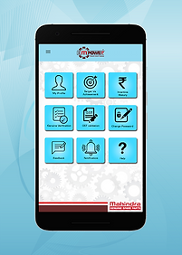
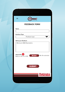
Mahindra eMPower: Auditing procurement app
HEURISTIC EVALUATION
2023

How might we understand how eMPower, Mahindra's spare parts procurement app, compares to industry benchmarks, to improve the app on both UI and UX levels?
Solution
I did a heuristic evaluation of the app on three levels - quantitative, qualitative and competitor benchmarking.
Qualitative analysis involved auditing the app against Nielsen Norman's 10 usability heuristics, along with other industry accepted qualitative standards.
Quantitative analysis graded the app on a scale of 0-3 against 324 benchmarks defined by the Baymard Institute.
Finally, I offered benchmarking comparisons to other apps meeting the heuristic standards that Mahindra performed poorly on, and could aspire to match.
Role
Solo UXR. The project ran for 5 days. I had periodic check-ins with Mahindra's business team to advocate for heuristic value and understand how the report could best communicate with Mahindra's executives.


UX Research Process
1. First pass
2. Second pass & N/Ng standards
3. Quantitative analysis
4. Benchmarking
First pass
To start the project, I did a first pass of the app and made notes of the most immediately apparent issues. These findings are meant to be instinctive and are often the highest impact usability issues.
Select findings are below:
-
Display of multiple permission pop-ups at opening making login difficult. Permissions not registered in the OS, causing the issue repeatedly
-
Poor colour contrast impacting readability
-
Usage of complicated marketing jargon hard to understand
-
Checkout/purchase function hidden behind excessive clicks/pages
Second pass & N/Ng standards
In a second pass, I went through the app with a fine-tooth comb, locating heuristic issues comprehensively. These included high, medium and low hanging fruit for app usability.
In this phase, I also tagged our findings to Nielsen Norman's 10 Usability Heuristics. Offering industry benchmarks can increase client faith in UX.
Instances of this kind include:
-
Creating a unified design system for consistent visual treatment.
-
Offering detailed information on each procurement incentive.
-
Improving information hierarchy in the display of functions.
-
Increasing accessibility of the app to help diverse users.

First pass findings are often instinctive and can be the highest impact usability issues. Second pass findings have low, medium, and high hanging fruit.
Quantitative analysis
In the next phase, I did a quantitative audit against 324 heuristics, across 11 categories, defined by the Baymard Institute. This yielded a final score of 1.26/3, considered low.
Categories of heuristics include:
-
Task orientation
-
Trust and credibility
-
Error tolerance
-
Accessibility
Each heuristic is specific and can be scored against the following levels:
0 - Does not meet
1 - Attempts to meet
2 - Somewhat met
3 - Meets or exceeds
These scores were then computed to create a spider chart that visually displays the app's score.
Numbers often make it easier for business teams to advocate for change.

Benchmarking
I offered comparisons to other apps meeting the heuristic standards that Mahindra performed poorly on, as inspiration and incentive to make changes.
Impact
Unfortunately, due to consulting ways of working, I do not have visibility on the business decision based on this research.